01
Brand Foundation
Mama's Mansion is a private entrepreneurship club. Everything we publish should feel selected rather than sold — quiet authority, never hype.
Purpose
To elevate the mindset, confidence and lifestyle of selected individuals through mentorship, residence experiences and personal growth.
Positioning
A members' environment where entrepreneurship is taught inside a luxury residence — not a course, not a coaching program.
Promise
Selective entry, personal mentorship, and a philanthropic engine that returns value beyond the membership.
The three pillars
Mama's Mansion
The club and residence experience. Mentorship, standards, environment.
The Foundation
The philanthropic arm. Community, dignity, long-term support.
The Social-Impact Fund
Capital deployed behind members and causes with measurable outcomes.
When all three are named together, always use this order, separated by a thin vertical rule: Mama's Mansion | The Foundation | The Social-Impact Fund.
02
Logo System
The identity is a two-part system: the MM monogram and the MAMA'S MANSION wordmark. They may be locked up horizontally or used independently.
 Mama's Mansion
- Wordmark typeface
- Playfair Display, weight 500, uppercase, letter-spacing 0.08em.
- Horizontal lockup
- Monogram left, wordmark right, gap equal to 0.6× monogram height.
- Stacked lockup
- Monogram centred above wordmark, gap equal to 0.4× monogram height.
- Monogram alone
- Permitted at 32px and below, in avatars, favicons and app icons.
03
Clear Space & Minimum Sizing
Protected space equals the cap-height of the M. Nothing — type, rules, image edges or UI — may enter this field.
X = cap height- Clear space
- Minimum 1× X on all four sides of the monogram or lockup.
- Digital minimum — monogram
- 24 px height.
- Digital minimum — lockup
- 140 px width.
- Print minimum — lockup
- 35 mm width; below this use the monogram alone.
- Header behaviour
- Monogram 44 px tall; wordmark 30 px cap on desktop, 20 px on mobile.
- Favicon
- 64 × 64 px, reversed monogram on Mansion Ink, no padding beyond 8%.
04
Logo Misuse
The identity depends on restraint. The following are never permitted, internally or by partners.
Do not stretch, condense or rescale disproportionately.
Do not rotate, arc or apply perspective.
Do not add drop shadows, glows, bevels or strokes.
Do not recolour — Mansion Ink or Ivory Paper only.
Do not place on busy imagery without an overlay scrim.
Do not re-typeset the wordmark in another typeface.
Do not enclose in a box, badge, circle or ribbon.
Do not change the spacing between monogram and wordmark.
Do not use gold, gradient or metallic treatments.
05
Colour Palette
A near-monochrome palette: ink on ivory, warmed with champagne neutrals. Colour is never used decoratively.
Mansion Ink
#14110E · --foreground
Primary type, footers, overlays
Ivory Paper
#FCFCF9 · --background
Primary surface, reversed type
Champagne Mist
#EFEBE2 · --accent
Section blocks, quiet emphasis
Limestone
#F4F2EE · --muted
Cards, alternating bands
Slate Grey
#615D58 · --muted-foreground
Secondary copy, captions
Hairline
#E0DEDA · --border
Rules, dividers, inputs
Ratio
Approximately 70% Ivory Paper, 20% Mansion Ink, 10% champagne neutrals. Full-bleed ink sections are reserved for the footer, the cover of documents and single statement bands.
Accessibility
- Ink on Ivory
- Contrast 17.1:1 — passes AAA for all text sizes.
- Slate Grey on Ivory
- Contrast 6.4:1 — passes AA; use for body and captions only.
- Ivory on Ink
- Contrast 17.1:1 — required for all reversed type.
- Type over imagery
- Apply a 45% Mansion Ink scrim before setting any type.
06
Typography
Two families only. Playfair Display carries voice and hierarchy; Jost carries information.
Display
Aa
Playfair Display — 400 / 500 / 600
Headlines, pull quotes, the wordmark and section titles. Set tight (leading 1.05 at display sizes). Never bold beyond 600, never italic in headlines.
Text
Aa
Jost — 300 / 400 / 500
Body copy, navigation, labels, forms and buttons. Eyebrows and labels are uppercase at 0.24em tracking, 12px.
“Set headlines as sentences, not slogans. If it needs an exclamation mark, it is not our voice.”
07
Layout & Grid
Editorial structure: wide measure, hairline rules, generous vertical rhythm and square corners throughout.
- Max width
- 1600 px content frame, centred.
- Gutters
- 20 px mobile, 40 px from the md breakpoint.
- Grid
- 12 columns desktop, 6 tablet, 1 mobile; 24–40 px gaps.
- Vertical rhythm
- Sections separated by 96–128 px and a 1 px hairline rule.
- Radius
- 0 rem everywhere except pill buttons and avatars.
- Measure
- Body copy never exceeds 72 characters per line.
12-column desktop grid
08
Photography & Motion
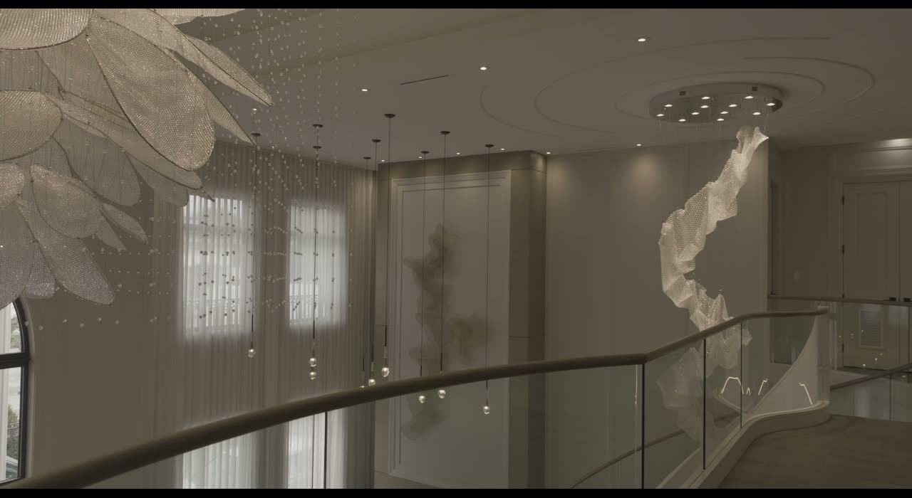
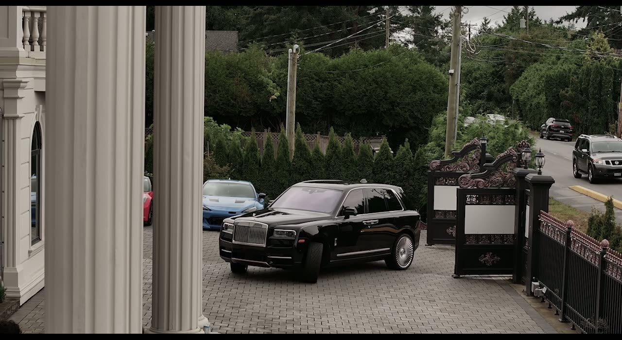
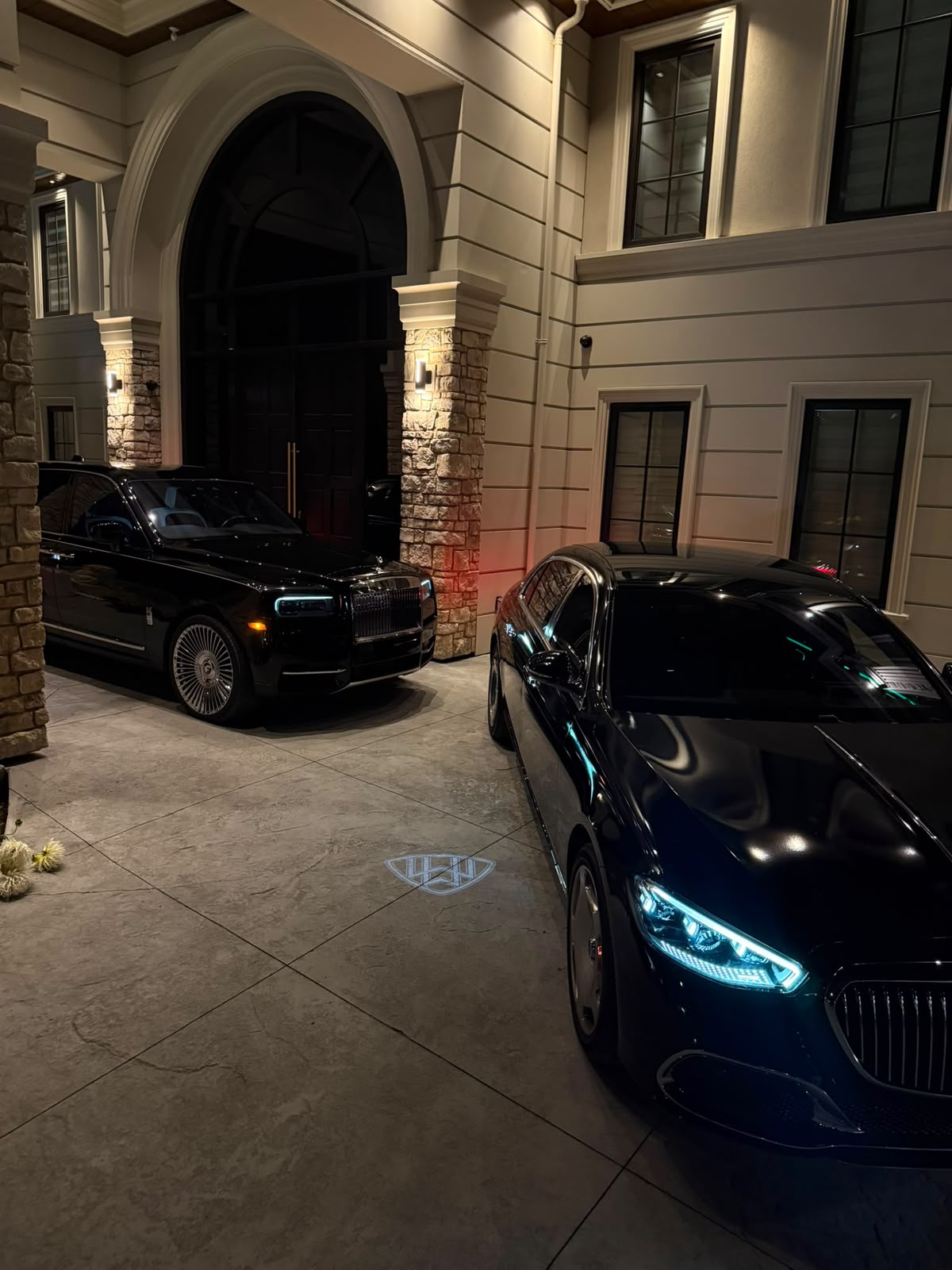
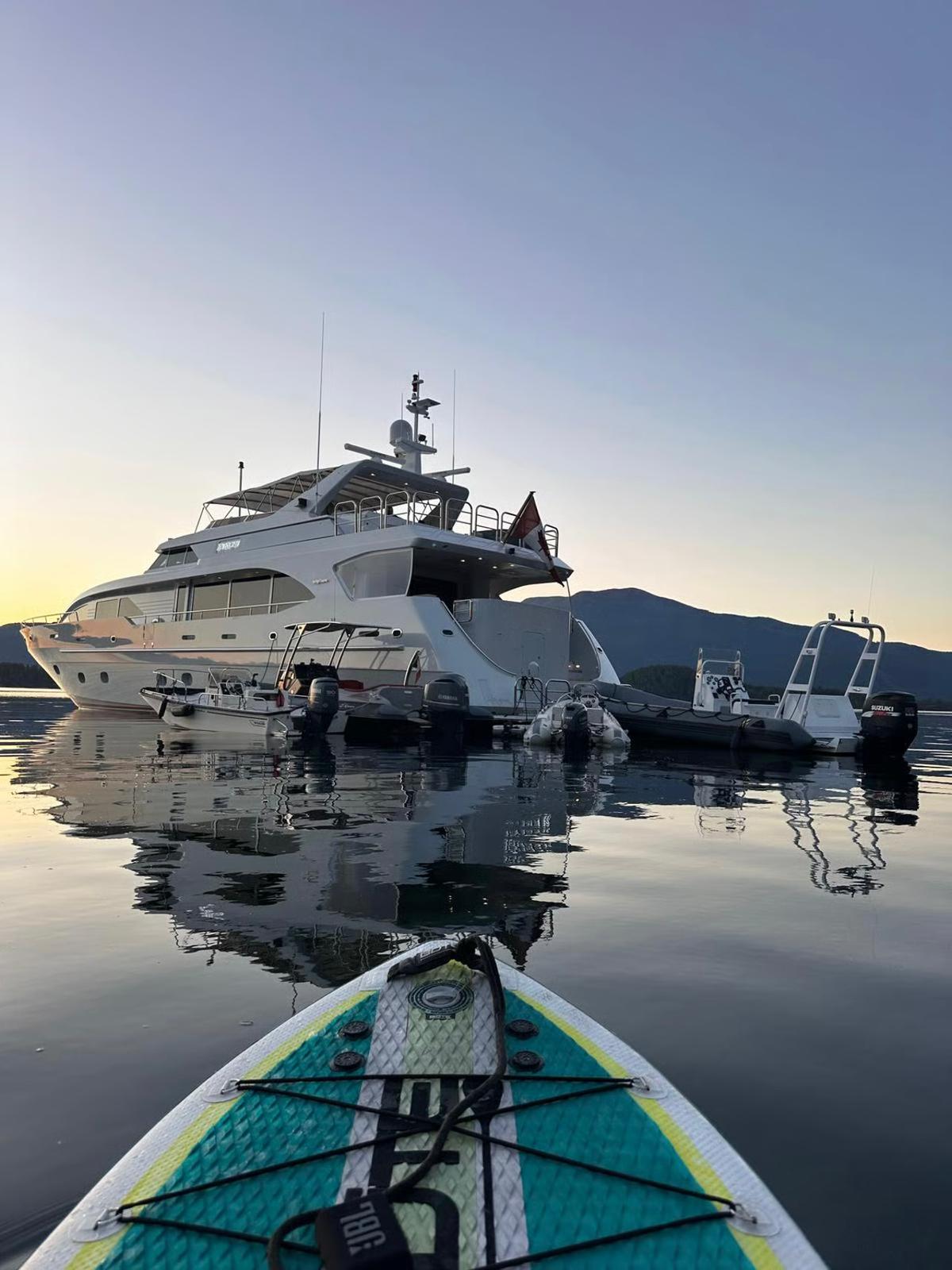
Cinematic, unhurried, natural light. Interiors and arrivals over faces; suggestion over display.
- Grade
- Warm neutral, lifted blacks avoided, saturation held low.
- Crops
- Full bleed or 4:5. Never rounded, never bordered.
- Overlay
- 45% Mansion Ink scrim whenever type sits on an image.
- Video
- Muted, looping, autoplaying, playsinline; controls hidden.
- Cuts
- Slow dissolves or holds of 4 s minimum. No whip pans or zooms.
- Motion
- Fades and 300–500 ms eases only. Nothing bounces.
09
Voice & Tone
Composed, precise, warm at close range. We invite; we do not persuade.
We are
- Selective
- Considered
- Direct
- Generous
- Discreet
We are not
- Hype-driven
- Urgent or scarcity-led
- Boastful
- Jargon-heavy
- Casual in writing
Write
“Applications are reviewed personally. Selected applicants are invited to continue.”
Avoid
“Don't miss out! Spots are filling fast — apply today!”
- Founder reference
- Always “Mrs. Tseng”. Never a first name, never “coach”.
- Naming
- “Mama’s Mansion” with a curly apostrophe. Never “Mamas Mansion” or “MM” in body copy.
- Pillars
- “The Foundation” and “The Social-Impact Fund” always carry the definite article and hyphen.
- Contact
- Contact form only. No telephone number appears in any asset.
- Currency
- Written as $10 and $1,500 CAD where clarity is needed.
- Punctuation
- Em dashes without spaces for asides; no exclamation marks.
10
UI Components
Digital components inherit the print logic: hairlines, square edges, uppercase micro-labels and a single pill-shaped action.
Buttons
One primary action per view. Labels are uppercase, 0.16em tracking, in sentence order — never more than three words.
Forms
Labels above fields, never placeholders alone. Square inputs, 1 px hairline, focus ring in Mansion Ink.
11
Applications
How the identity behaves across the touchpoints members actually encounter.
Website
Reversed monogram on video hero; positive lockup once the header turns solid on scroll.
Ivory background, ink type, monogram at 40 px, sent from the mamasmansion.ca domain.
Social
Reversed monogram avatar; 4:5 stills; captions in sentence case, no hashtags stacked.
Print & invitations
Uncoated warm-white stock, blind deboss monogram, ink foil optional at 1 colour.
Signage & residence
Monogram only, brushed metal or painted ink, minimum 120 mm.
Documents
Cover in Mansion Ink, contents page in hairline rules, Jost 300 body at 11 pt.
12
Governance
The identity is owned by the Founder's office. Partner and press usage requires written approval.
- Approvals
- All external usage approved in writing before publication.
- Asset requests
- Logo files and imagery issued on request; never recreate assets.
- Press
- Use the primary lockup on ivory or ink only; do not alter or crop.
- Review cycle
- Guidelines reviewed annually, or on any change to the pillar structure.
Questions, approvals and asset requests: use the contact form. This page is unlisted and intended for internal and partner reference only.